In such a block of course rules should be taught about readability, colour, prompts and lay-out. They should be part of such a block. Some sites become real Christmas tree with many coloured balls, flickering candles and other hidden goodies. And the producers start wondering why people have one look at the site and never come back.
But useability is more than only following some rules. From the beginning of developing a site, there should be user involvement in testing. These users should not be related to the development company itself, but they should belong to the target group. Even when the site has not been set up, there should be a discussion on the objectives of the site, the face and the tone. Page simulations may follow. In the beta version a wider testing group might be used and links checked with a programme. With a complex international site such as a railway site or a plane ticket reservation site thorough testing is no luxury, but a must.
In such a block students should be introduced to eye tracking. This method of following eye movements is very interesting. I recently was asked for such a test and was most fascinated by the results. The facial expressions can be seen, the eye movements rendered and the actions logged. Results might show that particular items on site pages attract the attention of the user or do not grab the attention at all. Eye tracking can be performed by specialised bureaus, who have the testing equipment.
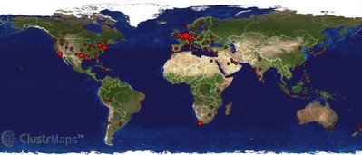
 And once a site is launched the usability should remain part of the project. Page and link logs should be kept to determine which pages have been looked at and for what amount of time. Tracing and tracking gives an insight in the user habits and preferences. When I started to put Onestat.com to this blog I learned a lot about the visitors, where they came from, what were their favourite pages and how many pages did they view, the referrer and their browsers. The last 20 readers of this blog came for example from the Netherlands, UK, US, France, India, Israel, Australia, Canada, Czech Republic and Spain. The figure shows a world map from Clustrmaps with the locations of last month's visitors. The stats of the pageviews show that half of the visitors are looking for specific items to which they have been referred to.
Usability should be a project in a project and should run in parallel with the project. By doing so costly mistakes can be prevented and traffic optimised.
Tags: content
Blog Posting Number: 560

No comments:
Post a Comment